

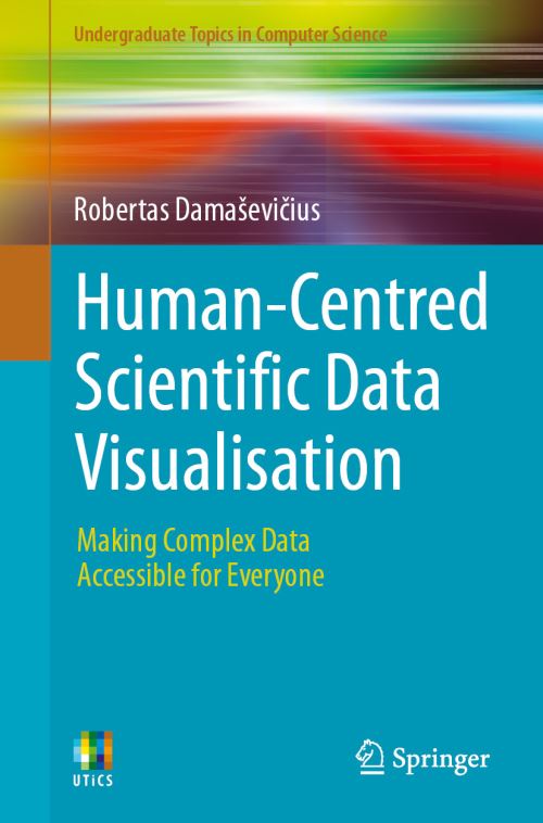
This textbook is a practical guide for researchers, educators, data analysts, and user experience (UX) designers who seek to transform raw, complex datasets into clear, accessible, and engaging visual narratives. Covering a wide range of chart types-including line plots, bar charts, box plots, scatterplots, histograms, pie and donut charts, spider plots, ridgeline plots, density plots, and advanced visualizations like treemaps, network graphs, and Sankey diagrams, it blends visualization theory with hands-on implementation in Python and R.
Combining the rigor of scientific communication with the principles of UX design, it offers practical techniques, real-world examples, and hands-on coding strategies in Python and R to create data visualizations that speak to both experts and non-experts. Whether you're visualizing data for policymakers, stakeholders, or the public, this book empowers you to build informative and aesthetically compelling visualizations that make data not only visible, but truly understandable.
| ISBN: | 9783032016058 |
| Publication date: | 24th June 2026 |
| Author: | Robertas Damasevicius |
| Publisher: | Springer an imprint of Springer Nature Switzerland |
| Format: | Paperback |
| Pagination: | 420 pages |
| Series: | Undergraduate Topics in Computer Science |
| Genres: |
Human–computer interaction Information visualization |
This textbook is a practical guide for researchers, educators, data analysts, and user experience (UX) designers who seek to transform raw, complex datasets into clear, accessible, and engaging visual narratives. Covering a wide range of chart types-including line plots, bar charts, box plots, scatterplots, histograms, pie and donut charts, spider plots, ridgeline plots, density plots, and advanced visualizations like treemaps, network graphs, and Sankey diagrams, it blends visualization theory with hands-on implementation in Python and R.
Human-Centred Scientific Data Visualisation features in the following genres: Human–computer interaction, Information visualization
Paperback. £44.99, down from the £49.99 cover price. Not Available.
Human-Centred Scientific Data Visualisation was written by Robertas Damasevicius and published by Springer an imprint of Springer Nature Switzerland
Human-Centred Scientific Data Visualisation has 420 pages
Yes it is part of Undergraduate Topics in Computer Science series
£44.99, reduced from £49.99. Not Available.